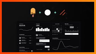
Introducing Svelte's UI Library Ecosystem
So you may have noticed over the past couple months I haven't been posting as often as I used to post and that's because I spent a lot of my free time working on building out these pretty awesome, pretty powerful UI libraries or UI projects for Svelte. And so today we're going to be talking about Shadcn-Svelte, Bits UI, and Melt UI, how they're unique, how they're different, how they're connected, and then also hopefully helping you decide which one you should use for your next project.
What is Melt UI? The Builder-Based Foundation
So let's start off with Melt UI, which is powering Bits UI and Shadcn-Svelte under the hood. And Melt is the most powerful headless UI library for Svelte that I'm aware of. I don't know of any other libraries that have the amount of components, the amount of tests, and the amount of overall customizability that Melt introduces. But unlike your traditional UI library or component library, we don't actually ship components. We have what we call Builder functions, which return the necessary attributes and actions to apply the functionality to those components. And so we've tried to condense this down a bit. So as you can see, all we have to do is say use:melt, pass in the store here or the value of that store, and it just works.
Right now under the hood, this pre-processor is actually transforming this into this. You might be asking, why do we need this? Well, if you want your attributes to be server-side renderable or server-side rendered, then you need them to be applied directly to the element because an action only runs on the client. Therefore, if you're doing like display: none or hidden and you want to like toggle something visible or not visible, if you're using an action, let's say you had the state set to open by default, it would first start out as closed and then flicker to the other state. And so that's what this gets around. Now granted, the syntax isn't great, but it's as good as it's going to get for now. And the amount of power this unlocks is pretty immense. So for one, you might notice immediately we can use scope Styles here because we don't have any components that we're worried about getting our CSS down into. We have access to all the elements. We can apply a class, we can apply Svelte transitions, we can apply Svelte animations, and then we can also apply our own custom actions in addition to the Melt actions here as well. And so if you're not aware of what a collapsible looks like, this is what it looks like. Now granted, you might think, okay, this isn't a super complex component to implement. Why don't I just do it myself? Well, we've also followed the W3 ARIA spec to a T, so we have the proper keyboard navigation for each of the different elements, we have the proper attributes. And so we've done all that research, we've spent the time to make these things right so that you don't have to do it every every single time you want to start up a new project.
Deep Dive into Melt UI's Customizability
And we want Melt to not only be able to be used by individuals on their personal projects or on their own design systems, we also want it to be able to be powering, you know, major component libraries in the Svelte ecosystem. And so we made a conscious effort to make sure that every possible functionality, or most of our functionality is able to be overridden on an as-needed basis. And so we expose a ton of different props. If we go to something like the date picker, which has quite a bit to it, we can go through here and see all these different props that we expose for all the various things that you can use to control it pretty easily.
But then if something is not exposed as a prop, we also offer many different ways to kind of take control of the behavior. And so we go into what the difference is between controlled and uncontrolled here. Basically, uncontrolled means that we're controlling the state, right? So whenever you click on that button, it's going to turn the collapsible open state to true. When you click it again, it's going to turn it to false. And in this example here, we're using a dialogue. And so if we look here, we can actually straight up modify that open state that's returned from the dialogue to open it. So if you wanted to programmatically open that dialogue, so you wanted to trigger it based on some other state inside of your component, you can do so by setting open to true using that store and your state's going to reflect inside of the component, your dialogue is going to open.
And so we also have something called Bring Your Own Store, or BYOS for short. And what this allows you to do is pass in your own store to the Builder, and we're going to use that and update that inside of the component. So whenever you click on, you know, the dialog's trigger, it's going to set that custom open store to true. When you close it, it's going to set it to false. And this is useful if you had some state defined higher up in the component tree. Let's say you had something in your layout that you wanted to be aware of the dialogue's open state for some reason or another, well, you just pass it down through context, add it to your dialogue, and then it's going to be used inside of the Builder.
Now with that, you might say, okay, I don't really know if I want to just pass my state down to you guys. That's kind of, you know, what if you guys do something I don't know you're going to do? Well, we have the change function as well, which I talked about in a previous video about stores. And what this allows you to do is basically override any of our internal decisions based on whatever condition you deem necessary. And so you can pass an onOpenChange prop with a change function, and it's going to get the current value, so what is the open state currently, and what are we trying to change it to inside of melt, and then you can override that by returning something different inside this function. So you make sure you have full control over that open state. And again, it mentions this is a contrived example because it is, but it is very powerful and we're going to talk about it more when we get to bits.
Overriding Behavior with Custom Events
So we also have custom events. So as I mentioned in those actions here that we're using, so you can see how we say use:root, what that's doing is actually grabbing that node and applying event listeners to it. This is kind of our way of being able to spread events that Svelte 4 and below don't have the capability to do onto elements. And so with those custom events, we actually redispatch out our own melt event, which allow you to basically override that behavior. So for example, on the dialogue's open button, when you click on it, guess what? It's going to open the dialogue. Let's say for some reason you didn't want that to happen, not that you wouldn't, but you could just call preventDefault inside of this m-click handler and it's going to override our default click behavior.
Introducing Bits UI: Headless Components Made Easy
And so this leads us to Bits UI, which is a headless component library built on top of Melt UI or powered by Melt UI Builders. And what I was able to do is basically take those Builders and make headless components. So as you can see, if we check out the accordion, you'll see it's a more familiar component interface where you just pass in props, right? Because I know not everybody is interested or excited about the Builder pattern, but it is undeniably powerful considering that you can use it to build things like this. And the reason that I made this was not only because I prefer this pattern, but because Shadcn-Svelte relies on this pattern. And because of the whole copy-paste nature/CLI own the code nature, if we were to copy and paste the entirety of the Melt Builder code, it could be a bit messy inside of the user's applications, and I want to keep it as minimal as possible where I just have a component with the styles applied to it.
So Bits UI doesn't have all the components that Melt has just yet. It is capable of having them all. I'm working on it. A couple of different components have been contributed by the community, which I greatly appreciate, like the pin input and pagination. But the docs recently got a major overhaul as well as the preview components by a team called Bitworks, Bitworks Studio. And they did this for free. I offered to pay them, but they did it for free out of the kindness of their heart to the Svelte community. They use Svelte for their client websites, so I greatly appreciate Pavl and his team for taking the time to build out these absolutely stunning um example components. Any errors you see with styles is probably me implementing their designs rather than it being an issue with their designs. But you can come through here and see all the different props and options that we have with Bits. Again, we don't have the same flexibility. We can't use scope styles, right? So if you're a scope style advocate, then unfortunately, really any component library is kind of out of the question for you, Bits included.
Now we do provide different ways to style it. So you can of course use CSS frameworks, Tailwind CSS, Uno CSS, and just pass in your classes like this. Everything is going to work. We also have data attributes which we apply to each of the different elements. So for if you go to any of the given components and you go to, let's just say the root, the data attribute data-accordion-root is going to be applied to every accordion root. Each one has their own data attribute. So you could apply those on a global styled level. Now, one thing to mention about Bits is it's not a styled component library. Like sure, there are examples here you can copy the styles from, and you can go and dig into the source code and get these examples if you wanted, but that's not the goal of Bits UI. These examples are strictly to give you an idea as to what you could make them look like should you apply the effort to style them, but they're not going to ship with styles. They ship completely unstyled, just like the Melt Builders do.
Introducing Shadcn-Svelte: Styled Components via CLI
Where styling comes into play is Shadcn-Svelte, and we have made some substantial improvements to it over the past couple months. I'm extremely, extremely proud of how far the project's come. And I'm also very grateful for the community who has contributed different examples and kind of helped take some of the burden off of me to stay up to date with Shad's rapid development pace. And so if you come check out shadcn-svelte.com, we have again a ton of new examples. Obviously all these components that are now available in Melt and Bits have been integrated here where we have combo boxes, drop-down menus, calendars, we have an OpenAI playground example, a bunch of different stuff that you can go and check out.
Now, if you don't like Tailwind, this library, this project is not for you. If you're not familiar with Shadcn-Svelte, basically it's a non-component library component library, meaning that basically there's a CLI script that you run and it copies the component code into your project. And that component code typically consists of Bits UI components along with Tailwind CSS default styles applied. And so if we head to one of the components here, like let's just go to context menu, they have a nice context menu here, and you can go to the code and you'll see that these look awfully familiar to the Bits UI, because that's what it is under the hood. It just applies classes to it. And you can check out the component source code here, and if we just go to like context-menu-content, we'll see that it's just a context menu primitive, which comes from Bits UI, with some default Tailwind classes applied.
How to Choose: Melt UI vs. Bits UI vs. Shadcn-Svelte
And so to answer the question of which one you should use: if you like scope styles, if you're planning on using CSS with scope styles, your really only option is Melt UI. If you want granular control over the elements and to be able to apply actions to every element and to be able to get that finer grained control, Melt UI is the best choice for you as it exposes the most number of props, provides the most level of flexibility.
Now, if you're someone that just wants headless components, but you don't want to have to worry about kind of setting all the the structure up yourself, all the DOM elements up yourself, then you can just use Bits UI. It's not going to ship with any styles. It's what Shadcn-Svelte was built on top of, so you could incorporate your own design system on top of it just as we have done with Shadcn-Svelte.
And then lastly, if you want some sensible default styles, you want to get some general idea of how it should look and then tweak those to your likings, then I would say start with Shadcn-Svelte. Again, you're getting the same Bits experience. It just already has some of the styles done for you which you can easily go and change inside of your code. We also have themes here which you can start out with some different colors. If you want to start out with a different brand color, you wanted it like orange or you wanted green, you can customize a theme to your liking, border radiuses, all that good jazz. And then just click copy code. This is what's going to go inside of your app.css file.
Conclusion and Personal Recommendation
So yeah, I want to make this video today and hopefully clear up I guess confusion around what the different things are as well as hopefully give you some an idea as to which one you should use, which one's best for you. Ultimately, you're the only one that can make that decision, can't make it for you. Personally for all my projects that I'm starting out from scratch, if I'm not building a component library out for it, then I'm going to be using Shadcn-Svelte because again, it gives me all the defaults I need. I can tweak them, make it look however I want, but I like to have all those defaults there, all the proper focus stylings, the different um, you know, preset cards and things like that are just super nice to have out of the box that we don't ship with Melt or Bits because those are more stylistic and structural rather than being a headless component that requires interactivity.
Thank you all so much for watching. If you guys want to see a deeper dive on Melt or Shadcn-Svelte, let me know in the comments down below. I hope you all enjoy these projects as much as I'm enjoying contributing to them and building them out. So have a great day. I'll see you in the next one.