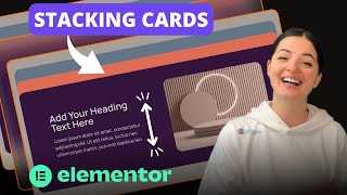
Initial Section and Container Setup
Hi everyone. So today we are going to be making something pretty easy. There is no code involved this time, for the first time in the life of this channel, but that doesn't mean that the feature is not going to be cool and useful. Actually, it's going to be pretty useful and it's also responsive. So let's get into it.
Alright, so let's first create our container. And I'm going to set this container to be a 100 VH and I am also going to give it a background color of sand. And this is the color that I have set in my global settings, and if you don't have it, don't worry about it. Just add any color that you want. Let's first of all make sure that this is full width, a hundred percent, yes. And I am going to drag in another container and let's set this container to be centered and give this container a full width of 75 percent. And also, let's make sure that the content in this container, the main container, is set to justify the center. Alright, so we have space on top of and bottom as you can see.
Alright, now let's focus on this secondary container and I am going to style it first of all to see it better. And I'm going to change the color or set the color to whatever color I have here set in my global settings. And I am going to give this a border radius of 25. And it's looking like this because we need to set a height, so I'm going to give this a 50, a 50 VH height. And let's see how it looks. It's looking all right. We're on the right track.
Designing the First Stacking Card
So I am going to set this container to row horizontal because we want to have two elements, two container, two additional containers sitting inside here, so basically one next to the other. So let's go and grab our container and I'm going to drag in this container a heading and I am also going to add a text editor. Alright, let me just set the colors of this text to something that we can see. And this horrible blue to the same color, basically, so we can see our elements.
Alright, I'm going to duplicate this and just delete the elements inside. And I am going to set the background of this container to an image. You can add an image widget but if you don't want to use too many elements for performance, then you can skip that. But if you for some reason need to add the widget, the image widget in there, it's perfectly fine. I'm going to just add an image to the container. So I'm going to keep that full, repeat no repeat, default as usual, cover. Alright. So, well our elements are a little bit too spread in this container. So I'm going to set the padding to be 60 top, 60 bottom, and 95 left and right. And I think it's looking much better. So let me set the content Center here and border radius to 25 on the image. And I think it's looking good. I'm also going to set a gap between elements to 95 and I think that's okay. Maybe I'm going to go even 5 pixels below that. Yes, that's okay. And I'm going to also resize this container to be 95. Alright, so this is our first container and it's looking pretty good, pretty slick.
Duplicating Cards and Setting Z-Index
And I want to basically create three additional ones. So I'm going to just duplicate and duplicate. Alright, so let me just change the background of this one to orange, change the image of this container to something else, this one. And I am going to damage to large. Alright, it's looking good. And also the third one I'm going to change the image to something else to work and the color to something else because we want to see them distinguish. Alright. So far so good.
So in order for this containers to basically overlap each other when we scroll, we need to set a z-index on each. So I'm going to give the first one a Z-index of one, second one a z-index of two, oops, two, and the third one z-index three, and so on and so on if you have more containers. Oops. Alright.
Applying Sticky Motion Effects
So now it's time to set our sticky elements, right, to make this work. Alright, so let's go to Advanced, to Motion Effects, and I'm going to turn on the sticky top option. And I'm going to leave this on all devices, desktop, tablet and mobile, because it works on all of them. So I'm going to set an offset of 50. And what this means is when our element reaches the top, there are 50 pixels at the top that the element does not go further and the rest of elements go over it. And once all elements have finished crawling up, then everything else goes up. Alright, you will see what I mean. So I've set this to 50 offset and the next one I will set it to 150 offset, but first let's set the sticky effect an offset of 100. So let's see what happens. And as you can see it basically stops 50 pixels before it reaches the end of the first container and another 50 pixels before it reaches the top. So all this Gap here is 100 pixels and if we don't want it to stop here, we can actually set it to 50 as well and it's going to go over this first container, but I think it's a very nice effect to have it in here in a sense, in my opinion.
So I'm going to set the motion effects of the third container to top sticky as well. And this is going to be 150 because we have to account for the pixels that are set on the second and the first container. Sounds a little bit complicated, but it's not. So now let's see what happens. Alright, this is good, this is good, this is good. But as you can see, everything on the page continues scrolling behind these containers and our containers are just sitting sticky on the page and we don't want this effect obviously, right? I mean it's cool but it's not user friendly.
Alright, so what we need to do is basically set these containers all to stay in column, and you will see what that means. Let's set the third one as well, and our third container. So let's see what happens now. And as you can see, as we scroll, they all go together, but the effect is still there. Yes. and yes.
And now as the next elements roll in, basically the second major container pushes everything up, and now everything goes up. And as you can see, there is a gap between the elements because there's a gap set by default between elements in Elementor. So if you don't want the gap, you can just remove it but I think it's more interesting and it looks a little bit sleeker. So I'm going to set it back to 20 pixels and let's see how that looks. I think that's pretty cool.
Let's give this container some padding and I'm going to say 100 pixels. Look okay. So we're scrolling, we're scrolling, and here we go. It would be very nice if this basically stopped here and it didn't scroll. And then once it finished, once it arrived at the destination here at the 150 pixels, then everything else moves in and this three containers remain in the position that they are right now. I cannot figure out how to do that right now but maybe I'll come up with a solution. Nevertheless, it's still very cool.
So we could also give this container a margin bottom, uh padding bottom in this case. So let's see what happens with this setting. And as you can see, let's do it again. Let's see what happens right. Alright. Alright. And as you can see it lasts for a bit longer. Maybe we can also give this container just a 100 pixel top. Say it again. It's all about how you arrange the elements on the page. Okay, okay, we're getting there. Okay. Okay, I think this is good, right? Of course it depends as I said on what you have on your page, right? Because I might have something else here and this would be just a section and okay, I'm babbling right now, but you get it I think.
Making the Effect Responsive on Tablet
Alright, let's update and let's see how is this looking on mobile. Let's start with the tablet mode. And of course we have to switch to column vertical and most probably we have to remove the gap to be around five, maybe, probably maybe. And the size of this container where the image is set as background, let's set it to 30 pixels of 30 VH, and I think it's okay. Obviously we can also amend our the size of our font so it fits in one line, maybe, or we can also remove some of this padding. And let me just see what we can do, maybe say 30 top, 30 bottom, and 40 and 40 left and right. Obviously you can do whatever suits your use case. As I always say this is just me showing you what you can do. Let's set it to 60, maybe 60 is better. Yeah. And top 45 and bottom 45. Eh, more or less, right? Okay. I will do the same for the following containers and I'll be back.
Adapting the Layout for Mobile View
Alright, so as you can see this is pretty cool. It's working on tablet and yep, let's see on mobile. Obviously on mobile we have to reduce a little bit of this padding on the sides because it's a little bit too much. Top 30, 30 and maybe 40, 40. Let's see. And if we want to have this container have some space in between the margins we can set it to 95%. Alright, and that's how it would look on mobile. The margins on this, margin, padding, everything. And now we have more space around the elements and basically this is how it would look, and then the next one, and the next one. So, so I will style this and I'll come back.
Final Mobile Tweaks and Outro
Alright, so as you can see on mobile we need to either give more padding, uh more padding on the top, for example. Or let's say something like this. We could say 50 and bottom 50, and the same to the next one. Or we could amend our offset, but again, as I always say it is up to you. So I'm just going to do the padding change and that should fix the problem. Here, 50 and 50. And here we are, look at this. I think it's pretty cool.
And there you have it. If you'd like to see what else you can build with Elementor, watch this playlist here. And if you have gotten any value out of this video, please consider subscribing, liking, and sharing this video. And I'll see you next time.